
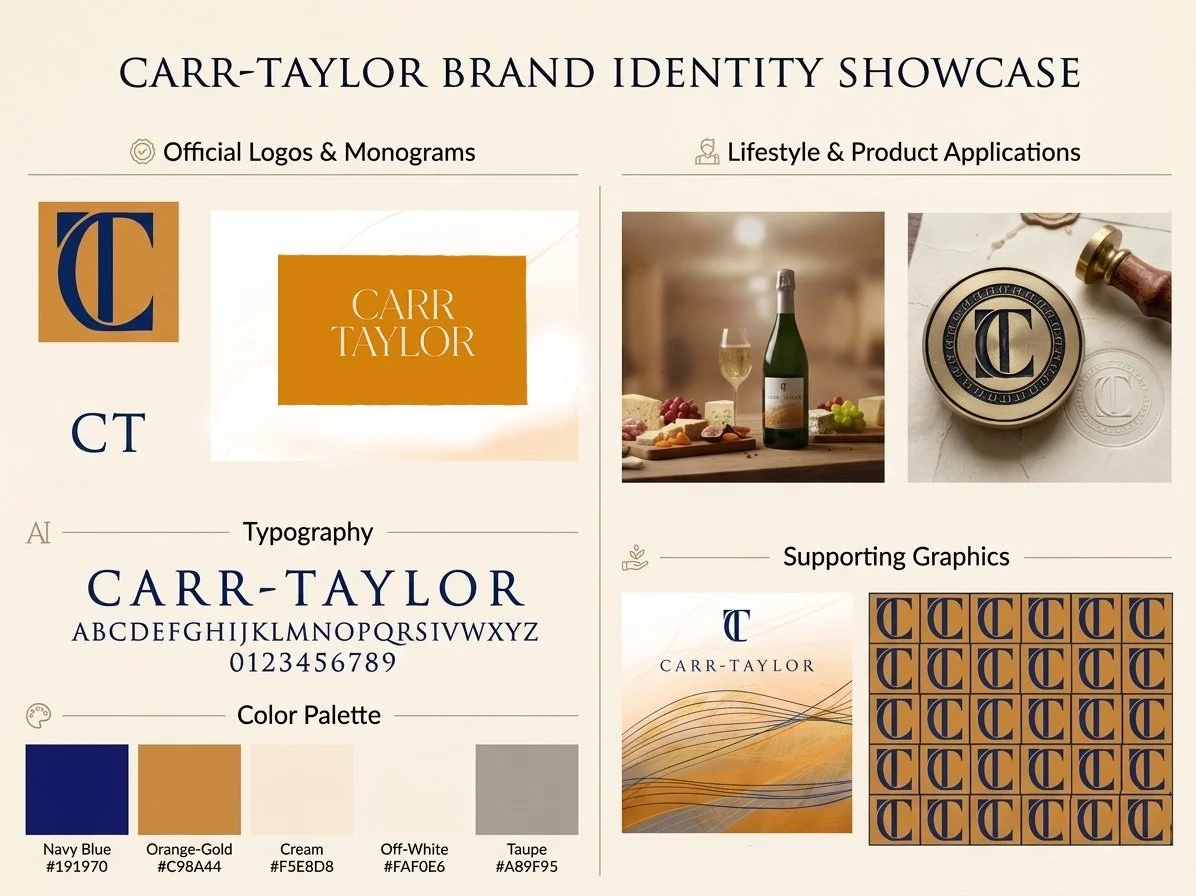
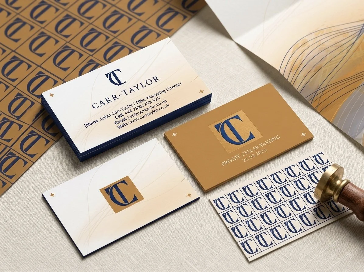
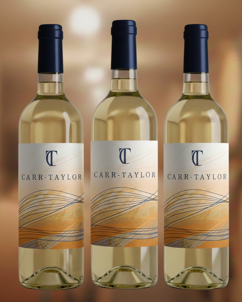
Creating a new label and look to the CarrTaylor wine brand.
I researched the history of the company and the land. One of the oldest vineyards in the UK. Therefore I knew the design of the brand identity would need to keep with the traditional sense of the company.
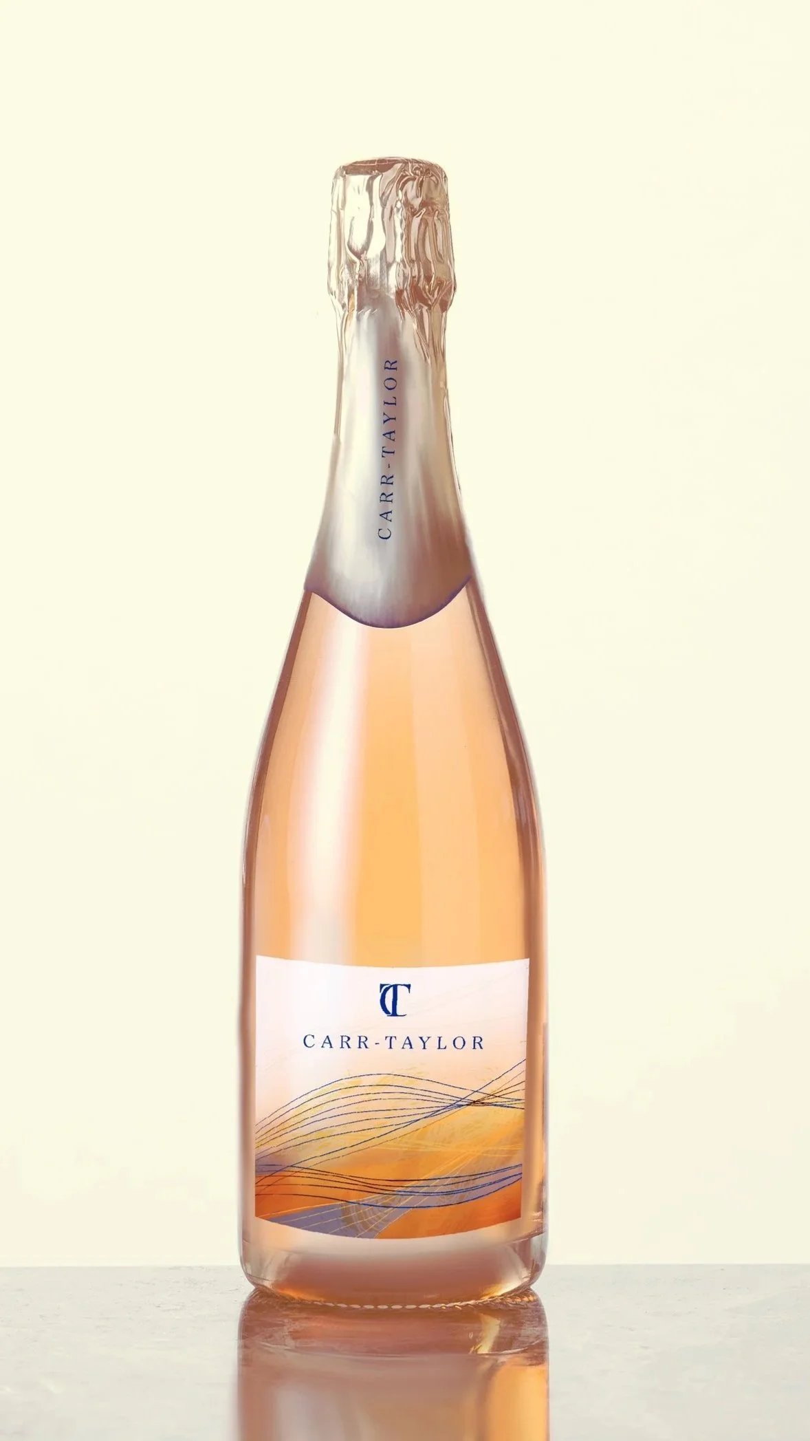
The soil which the grapes grow on is made of sandstone and clay as well as being located close to the coast. I wanted to incorporate this into the visuals.
This design feels more delicate, and the pattern Separate from the title helps balance out the design. The idea of this design shows the rolling hills of the vineyards location and from afar the lines merge to give that illusion of the land, like on a map. I found this design didn’t grab the customer audience as easily as maybe the colours need to be bolder. I used a colour close to sandstone which is too muted, making the colours vibrant will draw in the customers attention